 Github Stars:
 Last Commit:
  Created:
Overview
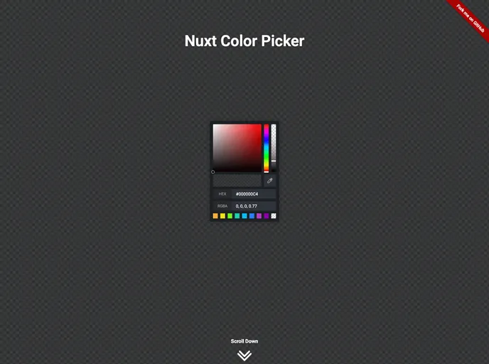
The Nuxt Color Picker is a powerful module designed for developers using Nuxt 3, aimed at simplifying color selection within applications. With its customizable features, this module allows for easy incorporation of color picking functionalities, enhancing both user experience and design capabilities. Whether you need a standalone color picker or a compact color block, this module has got you covered.
What makes the Nuxt Color Picker stand out is its intuitive design and flexible options, which cater to various use cases in web applications. It not only supports basic color selection but also offers advanced functionalities like EyeDropper support and color history tracking, making it a robust solution for developers.
Features
- Easy Connection: Seamlessly integrates with Nuxt 3 applications, allowing for quick setup and implementation.
- Full Component Customization: Tailor the appearance and functionality of the ColorPicker to meet specific design requirements.
- Multiple Use Cases: Use as a standard color-picker or as a block for a more compact presentation in your app.
- EyeDropper Support: If supported, users can easily copy colors from anywhere on the screen, enhancing usability.
- Color Selection History: Keeps a record of previously selected colors, enabling users to quickly revisit their choices.
- Initial Color Display: Shows the original color when the picker is opened, allowing users to revert if needed.
- Alpha Range Availability: Includes support for an alpha spectrum, enabling users to select colors with transparency options.
- Hex Input Option: Users can manually enter hex color values, providing greater control over color selection.


